Expanded Vision
A paint consult for a 1970s dwelling quickly morphed into a whole-house renovation.
Published in July/August 2023
- By
- Anh-Minh Le
- Date:
- July 28 2023

It started small, with the clients reaching out for guidance on paint colors for their new place in Larkspur. But, as interior designer Jennifer Wundrow recounts, things escalated quickly: Upon moving in, the couple soon realized that the 1970s abode needed more than just some coats of Benjamin Moore. Within a few months, they enlisted Wundrow’s eponymous firm again—this time, for a remodel that contemporized yet honored the home’s vintage.
“It was very choppy,” Wundrow says of the original layout. “They wanted it to be more open to the exterior, with more light in the kitchen and better flow. … They also wanted something that felt like the house, which was built in 1974, but a fresh look.”
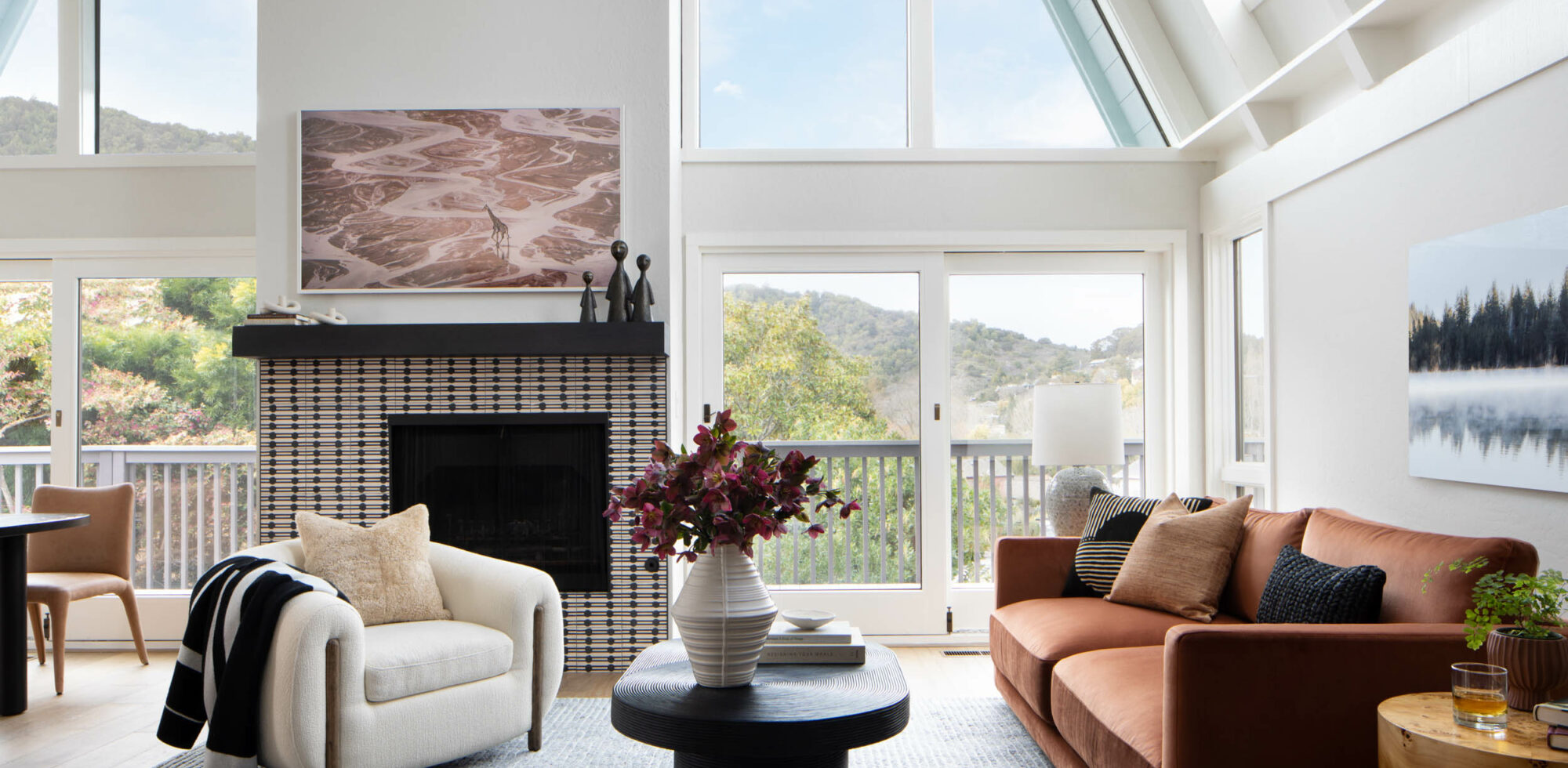
The ensuing renovation prompted the homeowners to temporarily move out. By the time work got underway, on Wundrow’s recommendation, the second floor’s ceiling beams as well as window and door trims had already been updated from wood to white. While that alone was a marked improvement, the real game-changer was removing two walls to yield a kitchen that flows into a living and dining space. The latter features a double-height pitched ceiling, plus glass doors and expansive windows that frame views of the foothills of Mount Tamalpais.
Although wood cabinetry was deemed appropriate for the era of the home, what came with the house was unappealing in style. So Wundrow conceived clean-lined oak cabinetry for the kitchen, and the clients’ affinity for natural materials translated to countertops composed of Paonazzetto polished marble, from Integrated Resources, with gray and gold veining. The hood with tambour detailing, along with the upper cabinets flanking it, are painted in Benjamin Moore’s Simply White. Floating shelves add to the now-airy atmosphere.
Since vantage points for viewing the Marin landscape were a priority, pendants above the kitchen island were eschewed and the lighting fixture above the dining table was carefully considered. “We didn’t want the chandelier to be obtrusive,” explains Wundrow. “We needed to find something that was a little bit understated, yet provided some interest.” The solution: a retro-inspired design consisting of four opal globe shades that emit a soft glow.
To maximize the great room’s floor space, Wundrow did away with the fireplace’s floating hearth; the charcoal gray tiles and cream grout on the surround were also banished. In their place, Erica Tanov’s Jacobsen pattern for clé Tile, in the plaster-and-black colorway, was introduced. “We loved the organic pattern play and graphic nature of this tile,” notes Wundrow.
On the same level of the house, an “atrocious bathroom” was reimagined with an oak tambour vanity and verdant zellige tiles from Zia Tile. The Calacatta Macchia Vecchia marble from Da Vinci Marble, used for the countertop and backsplash, also appears in a downstairs bathroom that Wundrow created by ingeniously combining two closets.
While the scope of the project significantly expanded from that initial paint consultation, according to Wundrow, broader changes were always intended by the homeowners, whose long-term plans were basically accelerated. “I think it’s important for clients to live in their house, even if it’s only for a couple of months,” she says. “They learned things about their house from being in it, how it does or doesn’t function for them. And in the end, we made a great team.”


