Mood Lifter
Interior designer Birgit Klein plays with light in Beverly Hills
Published March/April 2024
- By
- Jennifer Blaise Kramer
- Date:
- April 14 2024

Even Beverly Hills needs some uplifting sometimes. Such was the case when a growing family moved into a 1930s house that was within walking distance to Rodeo Drive yet required lots of love—and light. While the corner lot was bright and sunny, the interiors were dark and dated. In playing lightness and darkness, interior Birgit Klein created a moody atmosphere that feels fresh and new.
“The house was in desperate need for updating,” Klein recalls, adding that she worked with Jim Eserts Architects on the 4,500 square foot property. “We completely remodeled the home, changed the layout, and added new floors and windows, allowing it to be a much lighter space.”
In opening up the kitchen for a family who loves to entertain, Klein used Calacatta marble on the countertops and back wall, bouncing sunshine around the room, which overlooks the pool and backyard. Nearby, a pantry is hidden behind custom steel doors with frosted glass to match the other steel doors and windows while natural woods keep things feeling warm.
“They wanted to create a warm and family friendly home, yet one that was luxuriously and richly layered,” Klein says. “They also wanted depth and richness.”
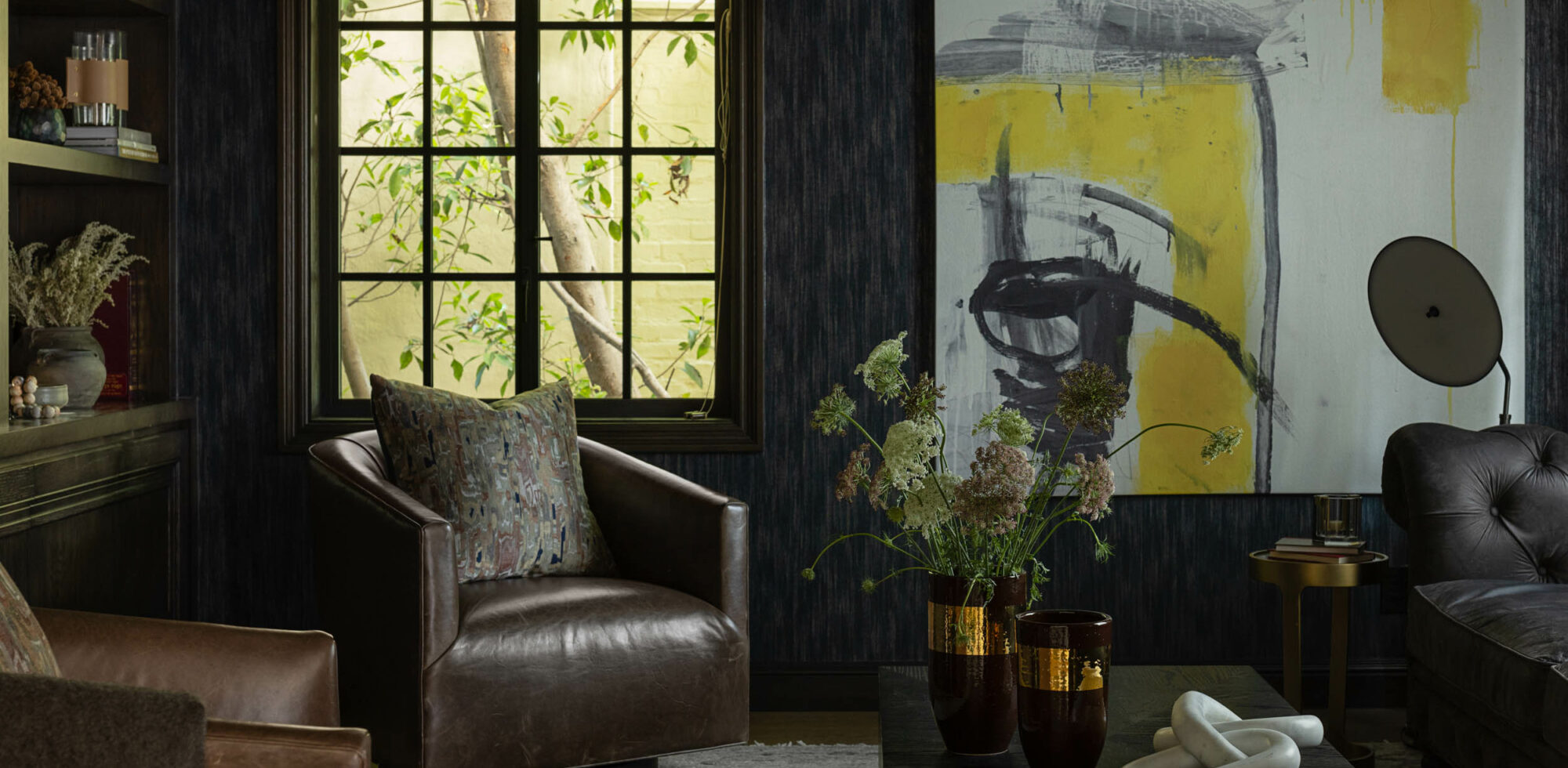
To achieve that depth, Klein juxtaposed light and dark to “evoke a sense of balance, depth, and character.” First, she established a color palette that would work throughout the home, adding moody colors in the primary bedroom, bathroom, and library. This inky hue shows up in materials such as paint, tilework, and wallpaper, while similar shades appear in accessories from bedding to lighting. Depth and drama run deep in panels of blue herringbone tile on a shower, while the library is clad in stingray wallpaper by Philip Jeffries, making a bold statement.
Part of the success, Klein says, is “maximizing natural light in lighter rooms and then using accent and ambiance lighting in darker rooms,” such as the Apparatus flush mount fixture in the library. Also, intermediary shades on furniture and accessories complement both dark and light spaces, helping tie things together. In looking at the big picture, it was key to maintain open sightlines between the darker and lighter rooms, so the transitions were seamless.
While a large part of the home has a plaster finish on the walls, bouncing more natural light around, wallpaper is used frequently to bring in color, pattern, and personality.
Much like the kitchen, light floods into the dining room, done in cheerful patterned Soane wallpaper. Again, warm woods grace the table and chairs with a family-friendly, fuss-free jute rug underneath and a sunny yellow Urban Electric light fixture hanging above. In the nursery, Andrew Martin wallpaper is neutral yet playful, offering a space that feels young get cohesive in the home.
“I love wallpaper and rich colors,” Klein says. “The client trusted us, so we went for it—and it paid off.”


